Art direction is nothing new, though there hasn't been an easy way to do it with most CMSs yet. Statamic, with the help of the spatie/statamic-responsive-images addon now offers an author- and developer-friendly way doing Art Direction with images.
What is art direction?
The article from A List Apart from above explains it in great detail, but the key takeaway is offering visitors of your website the best image for their device, in all aspects of size, quality and content. The content part is what's mostly referred to as art direction.
An addon to make it easy
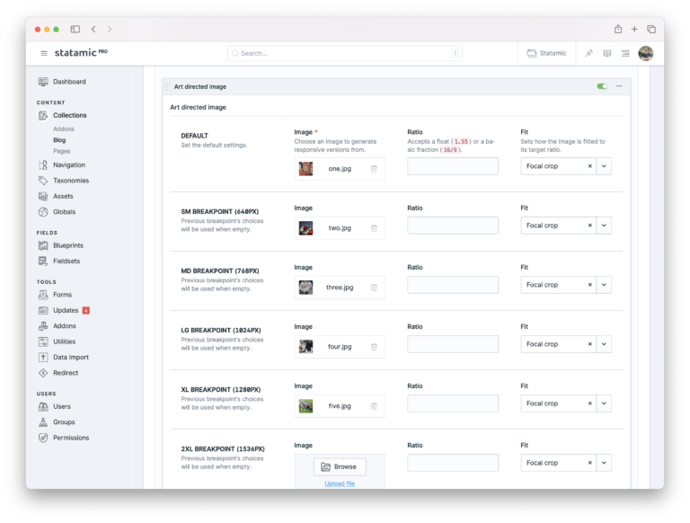
Statamic Responsive Images aims to make this really easy, by providing a fieldtype that allows you to set the images that need to be shown starting from certain breakpoints. The breakpoints are configurable in the config file.
For extra client flexibility, the options for ratio and fit can be toggled on or off.
After this, all you need to do in your Antlers template to make this work is the code below, and the addon takes care of generating multiple responsive variants in different sizes, generating both jpg and webp versions and setting the breakpoints correctly for the different images to be shown.
1{{ responsive:art_image }}